









Psicomagia
2009
Punta Piedras, Uruguay
Constructed Area:
400 m2
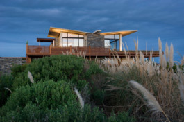
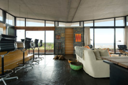
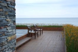
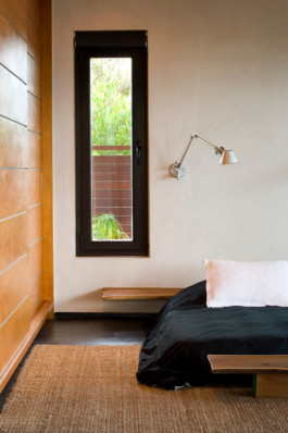
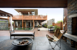
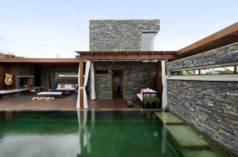
Psicomagia was designed in 400 square metres divided into two facing volumes; the first, which is directly on the street, contains the service areas, while the second houses the family residence, which was designed to serve as a buffer between the communal area and Punta Piedras beach.
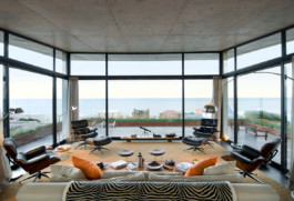
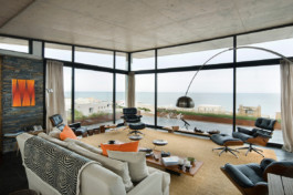
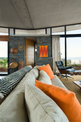
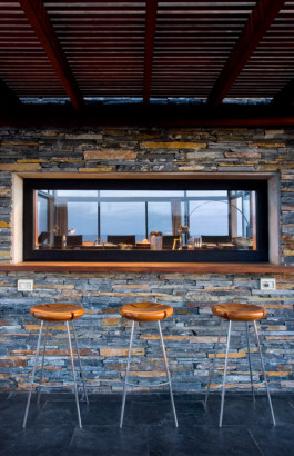
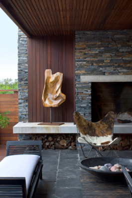
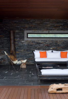
The morphology of these two prisms differs, since one is more closed and acts as a heavy container of services, while the other, which houses the social areas, is lighter, more open and more transparent. Both integrate into the landscape in different ways: the former resembles a large rock like a stone fortress, while the latter refl ects the environment from all perspectives due to its transparency.
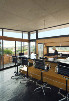
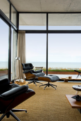
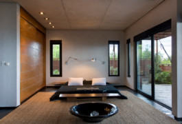
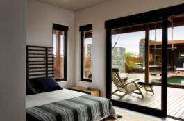
The horizontal architectural design aims to escape from the overwhelming skyscrapers of cities and instead make more spacious structures in which light plays a key role. For this reason, the concept was adopted of weightless floor-to ceiling aluminium windows, which paradoxically blend with the heavy concrete of the floors.
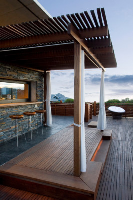
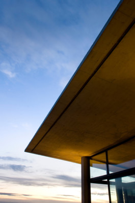
This horizontal emphasis in the composition is accentuated by the strength conferred by the eaves, which jut out beyond the façade’s line, in contrast to the lightness of the columns supporting them, conferring an ethereal touch on the massive ceilings, almost as if they were floating, like a bird flying to the ocean.